Component Structure:
- Most landing and feature components are in
@/features(e.g.,@/features/home/,@/features/content/).- General-purpose, UI, and utility components are in
ui/(e.g.,ui/button,ui/card).- Usecase Based Components are in
@/components/(e.g.,pricing-selector,testimonialscarousel).
Home/Landing Components (@/features/home)
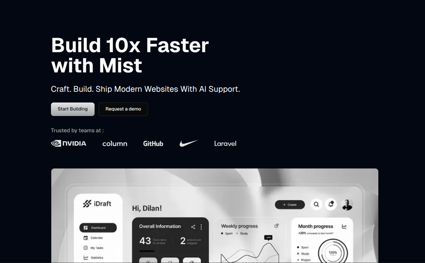
Hero Sections
Navigation


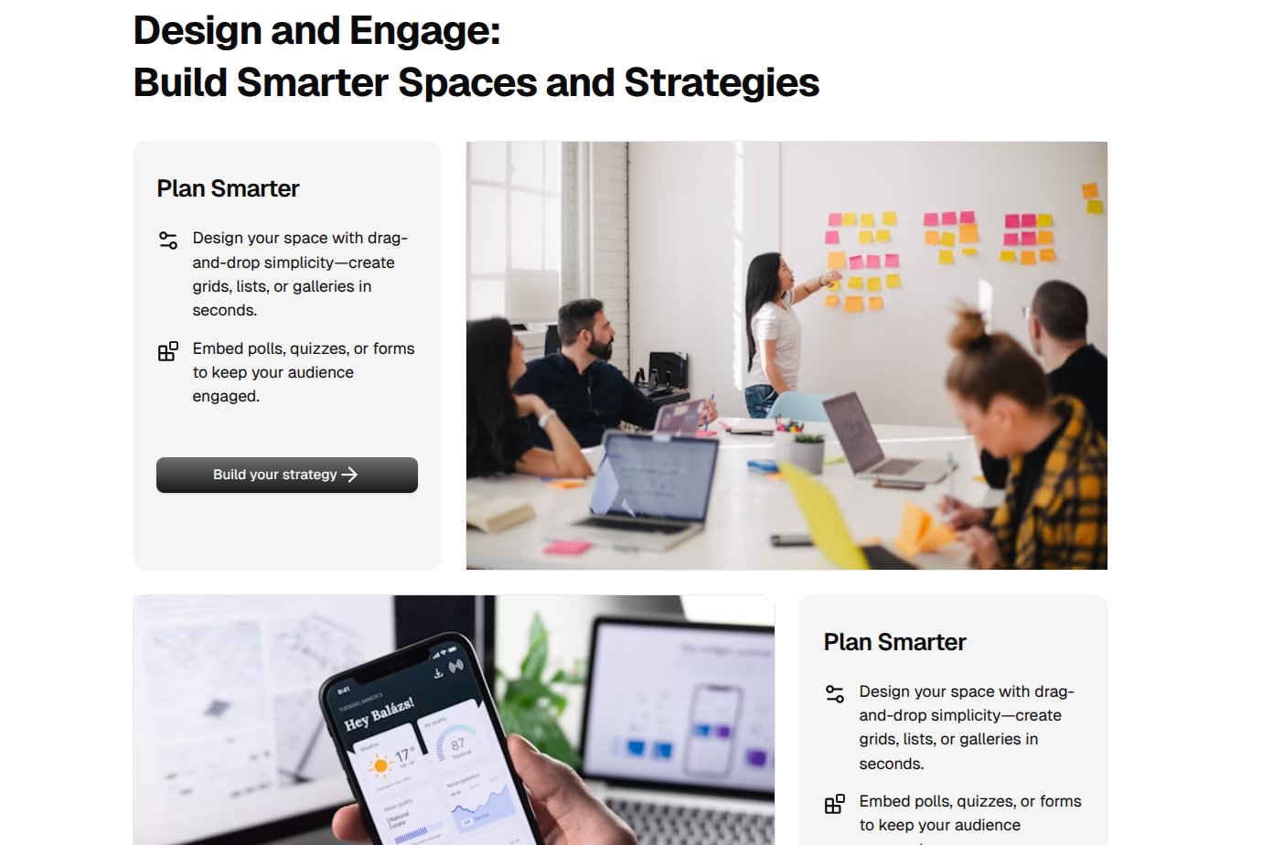
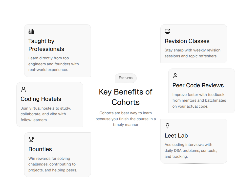
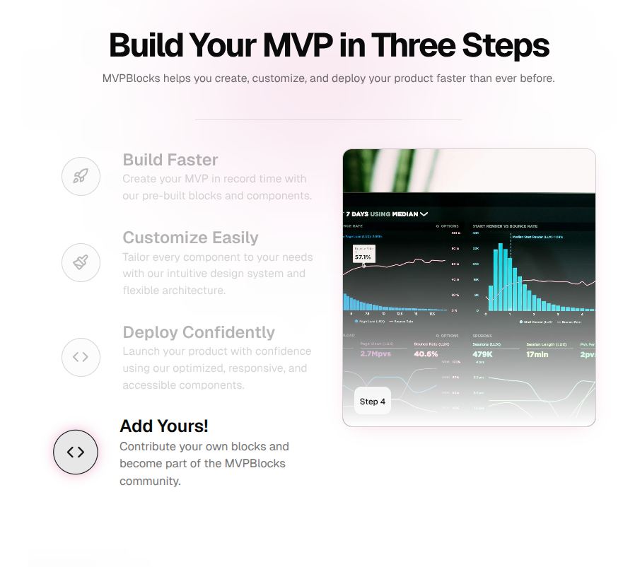
Features
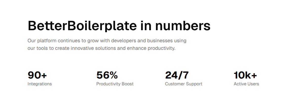
Stats

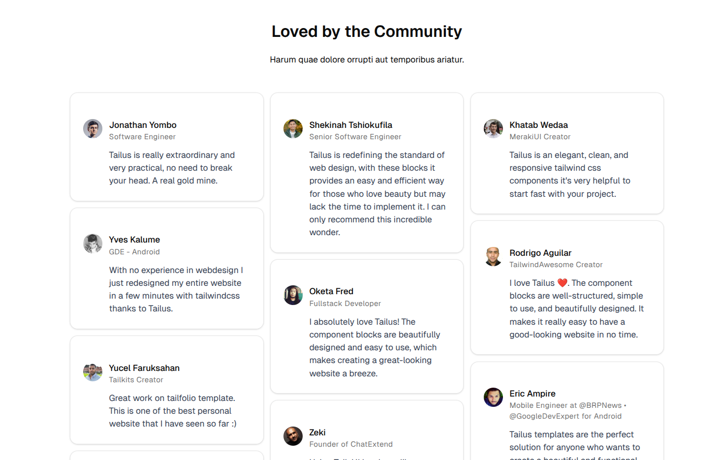
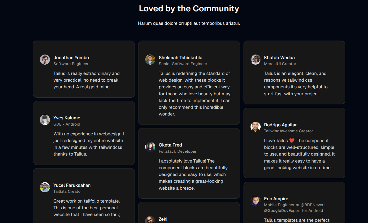
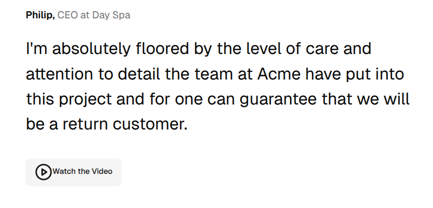
Testimonials
Pricing


Call to Action


Contact


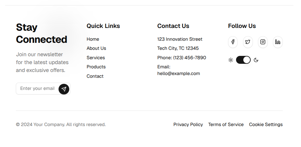
Footer


Bento Grid

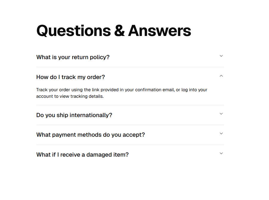
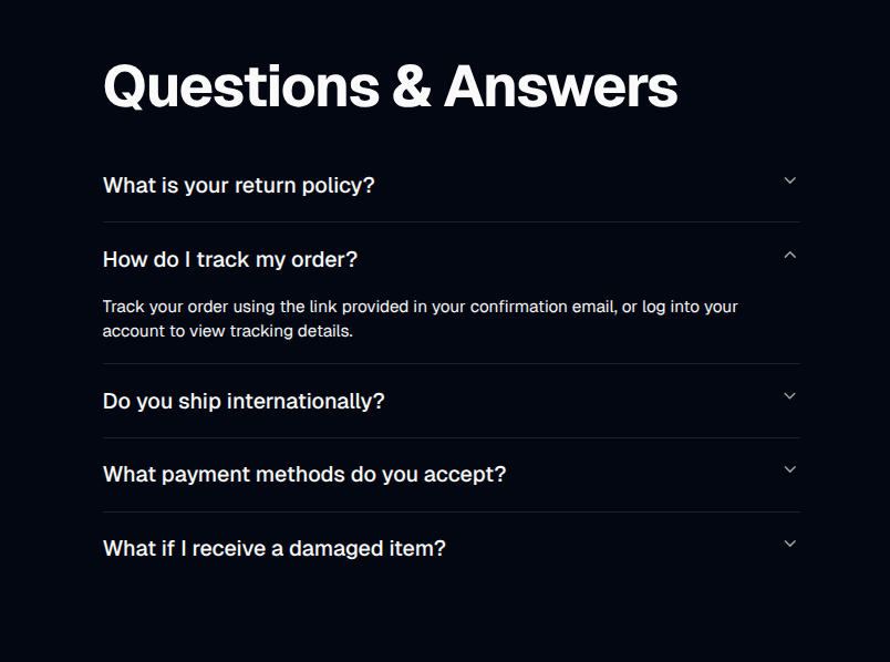
FAQs
Logos


General & UI Components (ui/)
- UI Primitives: All components in
ui/(e.g.,button,input,card,dialog,dropdown-menu,tabs,table,badge,avatar, etc.)
Top-Level Components & Usage
Below are usage examples for each top-level component (not inui/ or any subfolder), organized by use case. Each component preview image appears before its code example.
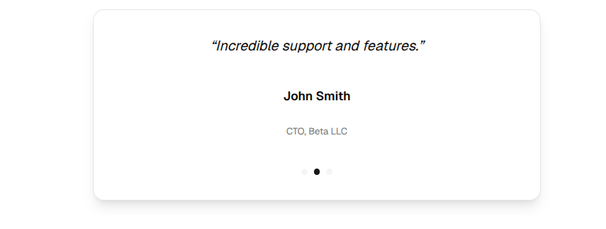
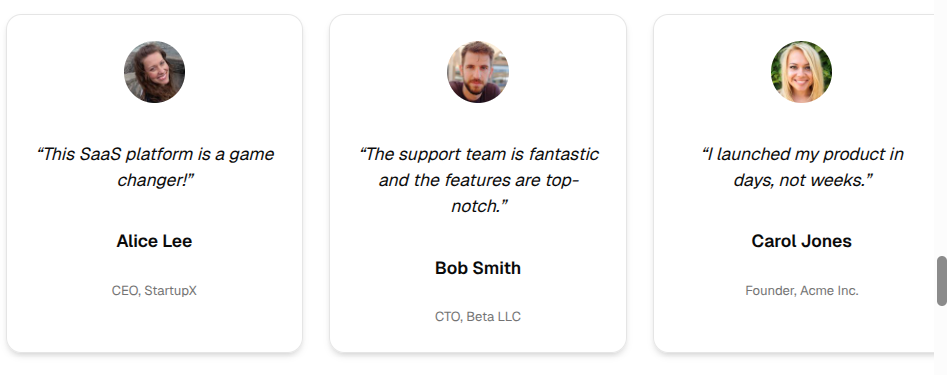
Testimonials Components
TestimonialsSingle
TestimonialsCarousel
TestimonialsAnimated
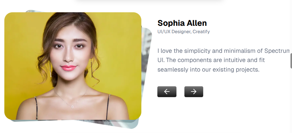
TestimonialSingle

TestimonialGrid
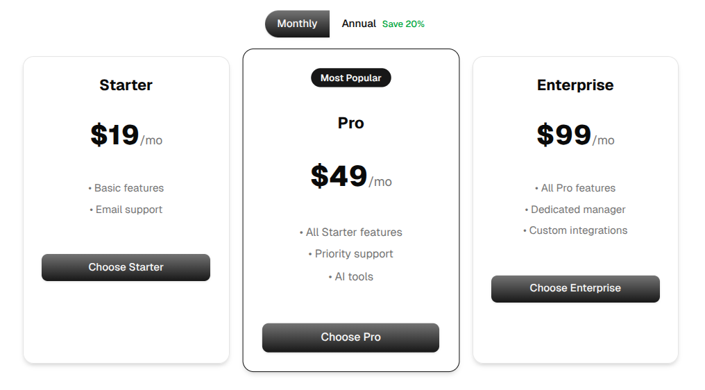
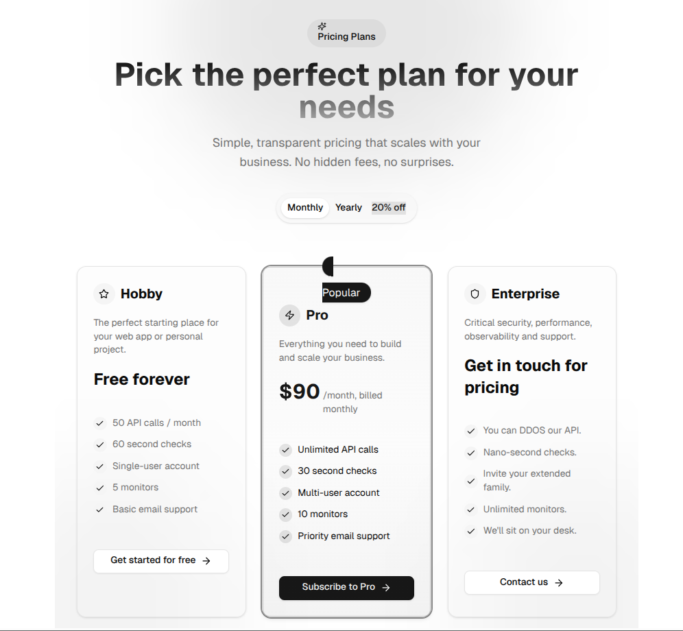
Pricing Components
PricingSelector
PricingWithModals
SimplePricing
Feature/Content Components
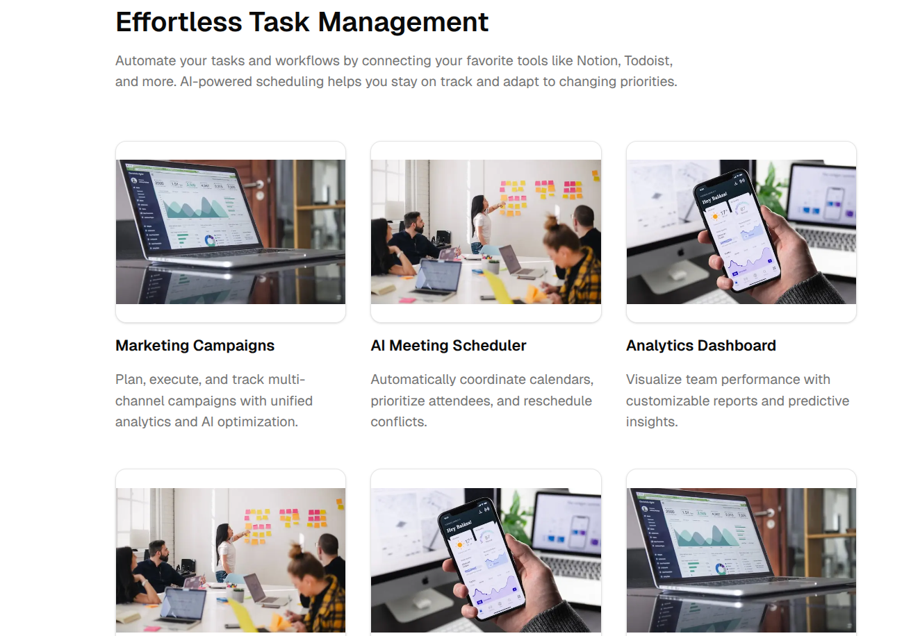
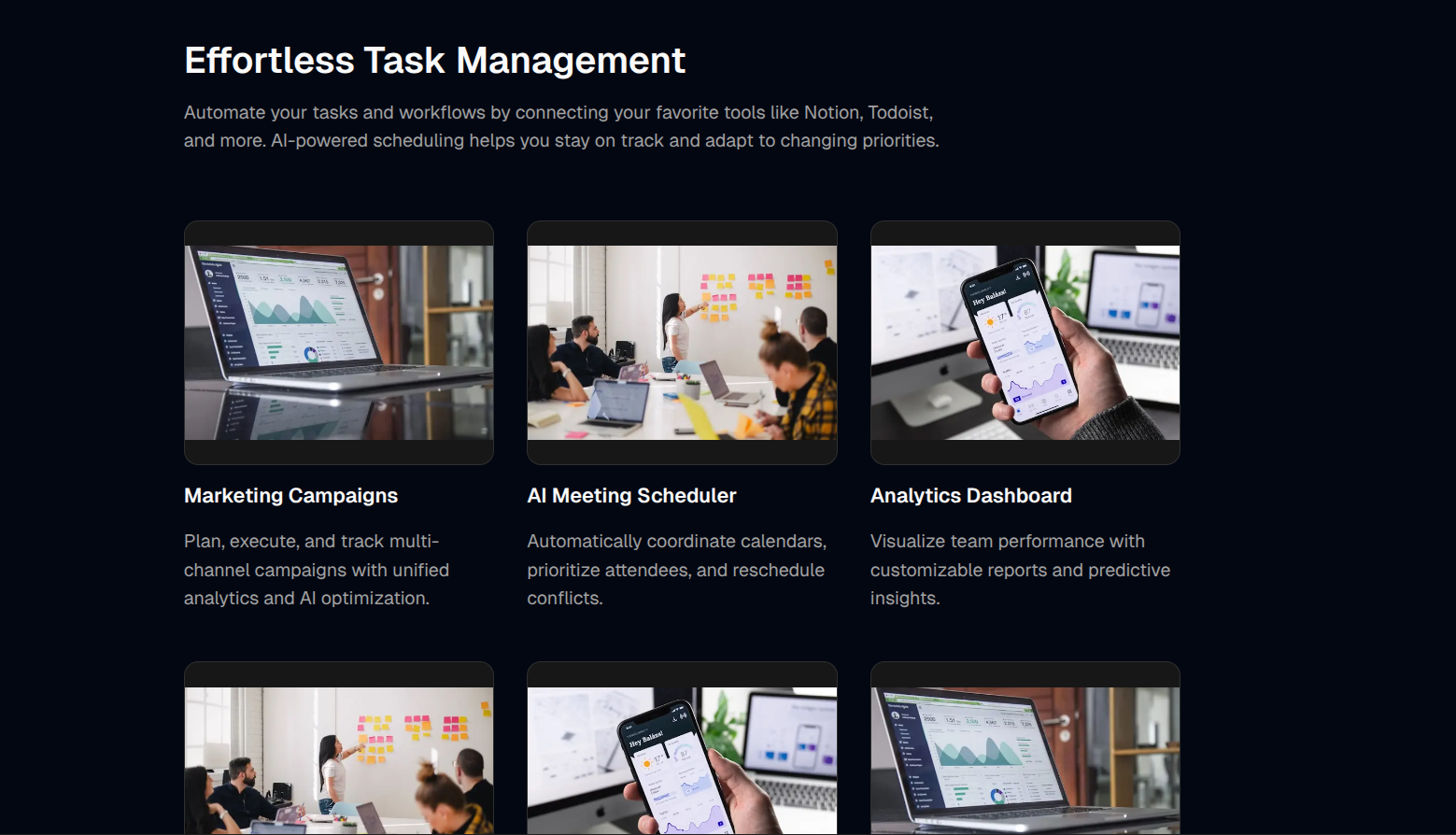
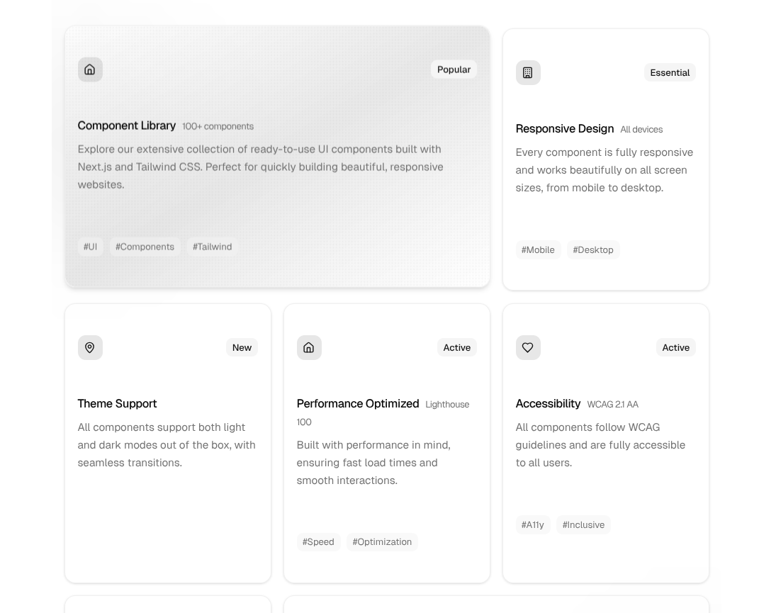
FeatureGrid

FeaturesCirculated
FeaturesBentoGrid
FeaturesAccordion
Navigation & Layout Components
NavProjects

Footer
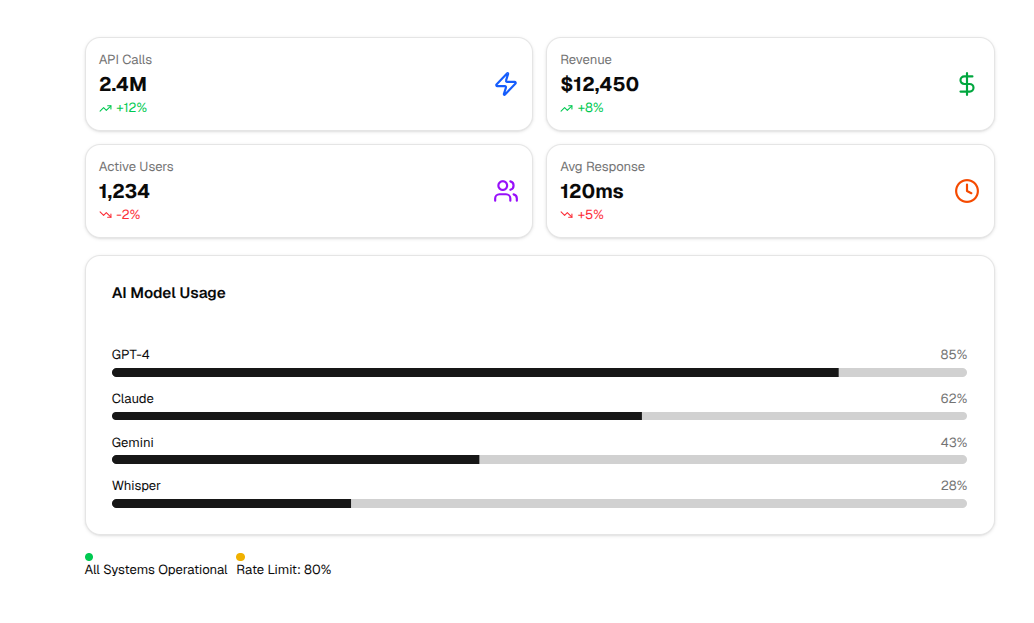
UsageDashboard
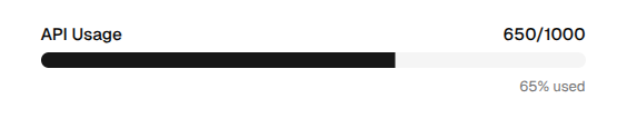
UsageMeter
AI & Prompt Components
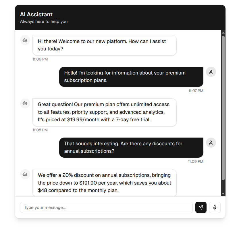
AIConversation
AIAnimatedChat
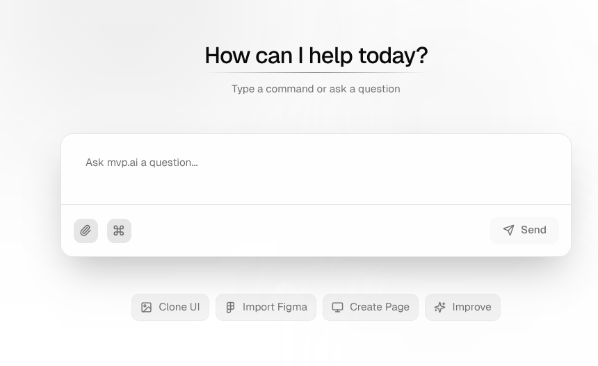
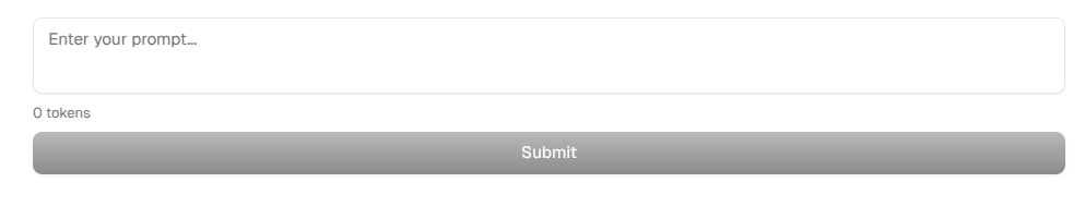
PromptInput
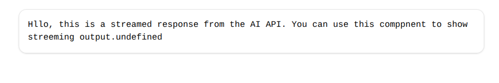
ResponseStream